|
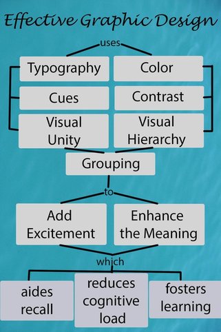
In creating this concept map regarding Effective Graphic Designs, I looked back over the various modules and Photoshop activities that were assigned. We utilized typography, color, cues, visual unity, contrast, visual hierarchy and grouping in order to grab and maintain the viewer's attention. Use of some or all of these were encouraged in order to be sure that our graphic was not overpowering, dull, or boring. This was done in order to enhance the meaning of the graphic and to add excitement to it, helping to reduce the cognitive load. This also aides in recall and fosters learning using the graphic.
|
| ||
